ゃおっす It's Spacy! I need to stay a top of my game and try make a blog post before monday bc if I don't I won't blog post until like Wednesday 😭. Besides the point. The real point is, is there a decline in visual quality in gyaru magazines? Were magazines back then simply better, or can Reiwa magazines really compete in terms of visual attraction? Is there a cause for all of this? Welcome to magazine discussion episode 6 - Visual appeal, Heisei vs Reiwa
Disclaimer: I'm not a graphic designer but I do know a thing or 2 about visual design yeah? fear this GCSE in art craft and design....this is all my opinion, ok?
Well first off, what is visual appeal? as a matter of fact, the term visual appeal can be applied in many areas, and in general the term visual appeal is obvious in itself, just the how appealing your product is, a better quality product has better visual appeal.
I think it will be a good time to talk about this article that actually inspired me to write this post by arama japan, in the article, it states 'There’s already been plenty of discussions debating the reasons behind the overall dull-ification of the Japanese fashion scene. The main argument brought up being the generational shift. The younger population, who grew up in a more complex & troubled social context tend to endorse a more safe and conservative lifestyle...The fact that a significant amount of former street fashion figureheads retrained themselves into a bunch of different ventures might be interpreted as a sign of overall decline of the Japanese street fashion scene. Fashion alone is not enough to sustain a career anymore : an alarming amount of magazines discontinued along with a number of shops or brands that closed down during the last few years, disrupting this once thriving industry.'
This part of the article discusses the death of japanese street fashion culture, and how the general conservativeness of the newer generations means unique street fashion culture fell out of prominence in recent years (this article was written like 2018/2019, so that context is very important to understand). This caused a lot of the influence figures, such as bloggers, models and such to shift towards other ventures outside of their said fashion subculture, because younger folks weren't interested in these street fashion subcultures, stores started closing down, magazines started discontinuing.
But this is about fashion, not magazines, well yes, but what is in these magazines? Fashion exactly, and because of the increase in conservativeness in younger generations, gyaru magazines and brands, shifted over to try and appeal to these younger audiences. This in part, caused shift in not only magazines visual appeal, but some of their quality aswell.
A comment by gurk on that same article sort of sums up what needs to be said 'Part of this is most likely because there are no big Japanese artists, models or entertainers (or other phenomenons like anime) in pop culture that very clearly represent some kind of subculture. And that didn't used to be the case, when pop diva's very often clearly gal/gyaru inspired, Johnny's and LDH represented gyaruo (and on LDH's case ora ora kei) in their own way and visual kei was more prominent. Nowadays gal pop divas are a thing of the past and new pop girls are generally very white bread, and Johnny's have been looking '' office ready '' for years. LDH groups also ditched their long hair, their facial hair and took a plunge into less gaudy, more '' age appropriate '' style.'
The contributing factors stated above contributed to the shift in design, content and marketing in gyaru magazines in like 2013-2014, and the eventual closure of many, who simply couldnt find an audience like they used to. But you know, thats not the point of the post, the point i'm leading into, is how this so called 'dullification' of gyaru still somewhat influences Reiwa gyaru today. For example, Reiwa gyaru doesn't have that brand culture that Heisei gyaru did, no arubakas (people who wore only Alba Rosa), no Black Diamond-esque D.I.A uniforms, ya know? You see snippets of old brands like D.I.A belts that models like Erika own, or the Alba Rosa coats worn by Black Diamond from 2000 did in cho-very lucky day, but those are brands of the past, Reiwa era brands don't really hold that sort of influence like Alba did per say, because if they did, maybe we wouldn't have shein warriors would we?... just maybe.
So what changed about gyaru magazines? Well first thing, self admittedly, some of us are a bit obsessed with the effects that camera quality has on older magazines, but what really creates the difference in Heisei vs Reiwa magazines is the difference between maximalism vs minimalism
I wanna go about this magazine by magazine, so the first magazine I'm gonna start with is Ranzuki:
When looking at this 2023 ranzuki magazine page for example
This page is showing off the outfit of this model (don't know her name i'm not too into Reiwa Ranzuki)
Theres a very clear colour scheme, being black, brown and white, and thats very overwhelming present in the page itself. The text font is also very basic, but most importantly, theres not a single focus point that attracts you at instant when looking at the page. The fact all 6 images are the same size, the fact that the white text blends in with the white background, everything is annoyingly minimalist.
Compared with this 2005 Ranzuki magazine
This magazine is effectively doing the same thing, but with a more varied selection of colours. Same memo basically, the colour scheme is green, black, yellow and pink, which are very overwhelmingly present on the page. But theres a focus point which definitely attracts you to whats important, which is the model and her outfit. On the side, you can see the main text title, big and stands out so it doesn't blend in with the background. They also never use green fonts to make sure green isn't too overwhelming in the entire picture itself.
What really makes these 2 magazine pages different is the use of design elements, like the 2023 one feels like it was made on canva and the 2005 one feels like it was made on adobe illustrator, ya know?
(probably not)
Theres clearly a difference in quality between the 2 designs. But i'm not here to actually dog on reiwa magazines, no not yet at least, so lets compare some more ranzuki 2023 scans to older ones.
Compared to the first 2023 page I talked about, theres clearly a difference between them, this one being more maximalist, theres a lot going on, but it's very clear. The colour scheme is also cohesive, being pink, white, purple and blue. With their being a unique composition the models are placed in which makes the page really hold together well. Actually this page really shocked me when I first saw it, I genuinely thought it was gorgeous. It's very easy to cherry pick new gyaru magazines nd say 'this is bad' or' this is boring' trust me i've done it before, however, when critically speaking, this new 2023 ranzuki magazine isn't bad in quality, it's actually amazing quality, but the specs of minimalism lack visual appeal compared to older ranzuki magazines which have higher visual appeal.
The next thing that definitely differs between older nd newer gyaru magazines are covers, and theres no better comparison for this then Koakuma Ageha:
Everyone knows those Koakuma Ageha covers in the early 2010's, with lots of glamour, pink and glitter, to the point where sometimes, you couldn't even see the Koakuma Ageha logo on the magazine.
Unfortunetly, I haven't had the opportunity to snag a new Koakuma Ageha volume, but I have seen their covers on instagram.
Now personally (and very personally speaking) I'm not even a fan of Koakuma ageha covers, and as the magazine as a whole, but Koakuma ageha were definitely the queens of maximalism, they had so much going on in there magazine covers, with the models, the logo, the glitter, but generally, at some point, a lot of their magazine covers started following the same colour scheme, usually pink or white, not a problem, if I wasn't a hater of overwhelming amounts of white. Sometimes i feel like my eyes are bleeding when I look at those older volumes im 100% serious. But that was Ageha's signature style.
However, 2023-2024 ageha magazines? Minimalist SLOP 😭
'But you just complained that the excessive amounts of white made your eyes bleed' yes I did, but that doesn't mean I want to fall asleep looking at it either. TBH it's boring. Especially the red one, and although a good feature of these newer magazine is the variety of colours they use, it does have a larger disconnect from the older koakuma ageha volumes. Does this mean the quality is bad? No, to be honest, i've never held Koakuma ageha in the highest regards when considering visual appeal, but Koakuma ageha definetly has those covers where you ask 'where am I supposed to be looking at' because the cover is like minimalist prison food, or 'what am I supposed to be looking at' due to all the texts, special effects and glitter added on. But in general, for me Koakuma ageha is always either a hit or miss in terms of quality, I mean, every now and then these days, Koakuma Ageha does see a spark and puts out a good cover like these.
(is this even an ageha cover...)
I think these covers are a nice fine line between too much and too little. But I think the era that Koakuma ageha had the best covers were like.... 2015 and then 2021, where you can still see the sparks of old Ageha, but not the sparks stabbing you in the eyeballs. I also think the same of their earlier volumes
So what I am concluding about Koakuma Ageha magazines. It's that the quality in both Heisei and Reiwa don't beat each other out, both Heisei and Reiwa Koakuma ageha have their sparks of brilliance and then their downs of cafeteria slop, but I don't really think newer Koakuma Ageha volumes are unappealing and poor in quality, I wish they'd just stop serving bland soup and spice it up a bit more like they did in like 2019-2022.
Something that really makes a difference between gal mags of Heisei and Reiwa stand out is boldness. Magazines like Koakuma ageha were definitely loud, glamorous, thats what made it so influential. One of my favourite magazines is Happie NUTS.
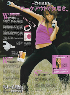
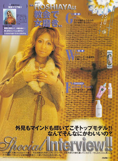
I love happie nuts, self admittedly. However, i'm gonna say it straight, in terms of quality and appeal, Happie nuts definitely peaked at the dawn of its publication. In its first few volumes in 2004-2005, you can really see they put those editors to work, theres nowhere to look and think 'hmm this is moderately boring' because it wasn't. For example, look at these interviews from this 2005 volume
It's literally everything, the poses, the use of colour schemes, everything is truly interesting to look at, theres hasn't been a single 2004-2005 nuts volume i've looked at that I haven't thought the editors weren't sent down from the heavens themselves...
Then the 2010s happened um.
'What's wrong with it tho' well first thing, I'm a pure hater for the overwhelming white thing magazines had in like 2013-14, I think it makes the page feel empty, but what really makes these magazines poorer in visual appeal compared to the older ones is because Happie NUTS very clearly lost that sexy boldness it had before. The change to clearly appeal to more mature and sophisticated (eheh) gals definitely shows since it feels a bit like a mix between SCAWAII magazine and an Ane Ageha magazine, rather then that boldness and unique colours of older volumes. Maybe this is a consequence of the slow decline of tanning, their attempts to shift more to bihaku style, or maybe its because the queen herself Hoshiaya and other models of her life time dipped and hauled in a newer and frankly uglier era of nuts, I don't know, but I'm not feelin it. It's not bad, it's still good quality, but to be honest, if I put 2013 Scawaii, Jelly, Blenda, and Happie Nuts in a lineup, I would just do eeny meenie miny mo and pick whichever one I land on because whats the point of being a fan of 1 when theyre all the same otana gal magazines?
But what about Reiwa Nuts?
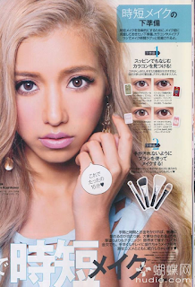
In my very honest opinion, Reiwa Nuts definetly has an increase in overall appeal compared to 2010s NUTS. One really iconic thing ab NUTS and mid 2000s gal magazines in general is that glowly bright tan that loads of these models have, and you can see NUTS bringing that back which I think is really goodBut in all honesty, Reiwa NUTS still doesn't have the same appeal as Heisei nuts. Although I do think Reiwa Nuts picked up much better then we left off, I still think ever present lack of creativity.
Boring textbook fonts, everything feels unfortunetly blander. But ofc, NUTS still has their big up moments, such as this new years photoshoot which I think is GOLD.
And now I've led myself into the end of this blogpost...
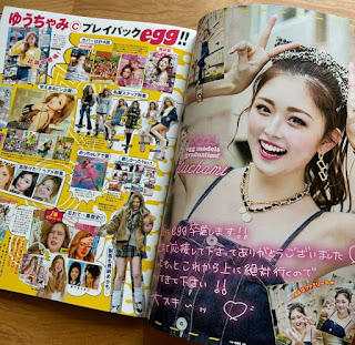
Yes no EGG, sorry I cant be asked to look though 2901619429 EGG magazines and chew EGG out for the fact that some of their 2013 volumes all felt the same due to the overwhelming amount of white pink and blue, so In short, EGG has definitely not only kept up their visual quality, but improved it immensely since 2014, to the point my eyes ARENT popping out my head, good job EGG 👍.
Where was I? Ah, yes I've led myself nicely into the end of this blog post, so what is my conclusion on this discussion? Sorry to say, but a lot of these reiwa gyaru magazine lack boldness. Lot's of them look nice, but a lot (maybe except EGG) aren't striking. It seems like these magazines want to play it easy and safe with the things like fonts, compositions and editing. This could all be linked to the so called 'dullification' of the generation of Japanese youths theyre attempting to target, but a lot of these magazines feel like when you see those 'renovation' tik tok accounts who paint over beautiful solid wood white to fit that modern aesthetic, like yeah it looked nice but it could've been better. I do however, think these Reiwa magazines do compliment this gal era at-least. Each magazine has their own unique touches that don't make them feel the same, but all these magazines genuinely encompass this same... whats the word, timidness to be bold or stand out except EGG really. Is there really no way to make it not crazy maximalist like the 2000s while also not making it snooze worthy? In my opinion yes.
Reiwa and Heisei era will never be the same, you can't force Heisei in Reiwa in my opinion, theres a point where you need to leave thing in the past, and take up new thing. Theres no poor quality magazine actually, all of them are fantastic quality, but in comparison to the magazines in their glory days of the 2000's, gal magazines haven't been able to create a new Reiwa formula to make their magazines as appealing as the Heisei ones. You'd never catch me boarding the 'Reiwa gal is bad/boring' train, the magazines arent boring, they just need a bit more umpfh umpfh imo
To finish this off, here are some reiwa egg scans I found on ebay to prove my point on how magazines can be reiwa and not partially boring
All magazine scan credits to Gal Revo - Bye bye, just remember this is my opinion dont shoot me
- Spacy


No comments:
Post a Comment